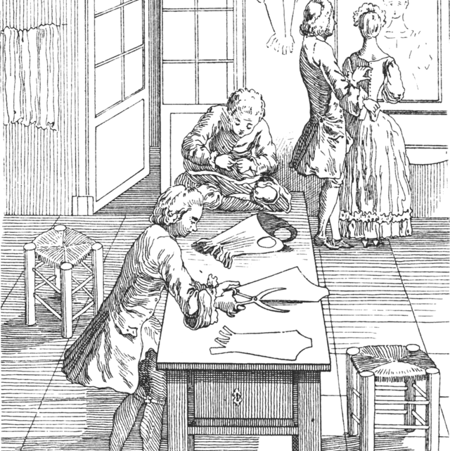
In 1843 the newly-ennobled 4th Marquess of Hertford added two paintings by François Boucher (1703-1770) to his private collection. These were created for free in the 1730s as a showcase for the emerging artist, and in situ on the walls of a wealthy lawyer’s Parisian home they drew gasps of delight for their rich Rococo style.
By 1774, however, these paintings that ‘the owner finds very beautiful’ were described as ‘detestable’ by a visitor. How could a collection of colours on canvas provoke such a strong reaction? What are the defining characteristics of Boucher’s art? Why was Rococo reviled, then revived in the nineteenth century? How can we view, and review this style today?
A closer look at this pair of paintings reveals the key characteristics of Rococo. Its name derives from ‘Rocaille’ the French for shell (of which Boucher was a keen collector) and even the clouds here take on a shell-like form.
Lines which twist and curl through space add dynamism to scenes which evoke gardens and grottos – sites of leisure and pleasure for the wealthy patrons.
Whilst education is required to identify the classical gods, goddesses and narratives drawn from Roman writers such as Ovid, these scenes are more decorative than didactic.
Pretty pastel colours and silky-smooth semi-naked bodies convey sensual pleasure. Europa conforms to eighteenth-century erotic ideals with her drapery drawing attention to body parts concealed in daily dress i.e. folds of flesh around the upper arms, long legs and dimpled knees.
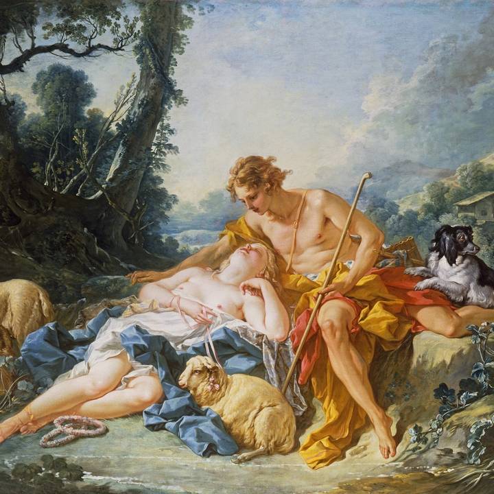
The Abduction of Europa shows the imminent abduction of Europa by Zeus in the form of a bull – a problematic concept, and subject previously portrayed by Titian. Despite the violence hinted at by its title (or perhaps because of it) the painting seduces our senses.
The central triangular composition creates a sense of stability. Is this a warning not to judge by appearances as, like Europa, we are lulled into a false sense of security by the apparent docility of the animal, the sweet-smelling roses and carefree crowd?
Flirtatious and frivolous subject matter characterises Rococo style, from Antoine Watteau (1684-1721), through Boucher, to his pupil Jean-Honoré Fragonard (1732-1806).
Pairing peasants, amorous aristocrats, and desire-driven deities typify the tone of the ancien régime which privileged pleasure. By the 1780s a revolution in taste meant that the asymmetrical curves of the gilded and candy-coloured Rococo were repudiated - replaced by clean, clear lines, and primary colours of morally-uplifting neoclassicism.
Whilst the ‘old regime’ relied on luxury trades to promote the socio-political interests of a courtly culture the French revolutionaries of 1789 condemned conspicuous consumption, and a style and way of life deemed decadent.
Boucher is famed for depictions of Louis XV’s mistress Madame de Pompadour, around whom ideas about Rococo - its reception and ultimate rejection – coalesce. Frothy and frilly peach fabrics abound (as echoed in Fragonard’s work).
Roses are the emblem of Venus, and along with Cupid, they confirm Pompadour as an object of desire. Love is blind, but we are invited to drink in every visual detail of this dynamic and sensuous scene.
The depicted statue was commissioned by Madame de Pompadour to personify ‘platonic love’ (her newfound role at court) but how can anyone resist the lustrous flesh and sensual silks that Boucher so expertly depicts?
Madame de Pompadour used ‘soft power’ to build her cultural capital and exert influence over court (and thereby country). Louis XV was melancholic, but she could chase away his dark moods. She dressed to impress and made strategic commissions of porcelain, statues, paintings and furniture to promote French luxury goods.
We can only imagine the impressive appearance of these exquisite objects in their original private interiors but are impacted by such gilded glamour at the Wallace Collection, where the richness of Rococo is publicly revealed.
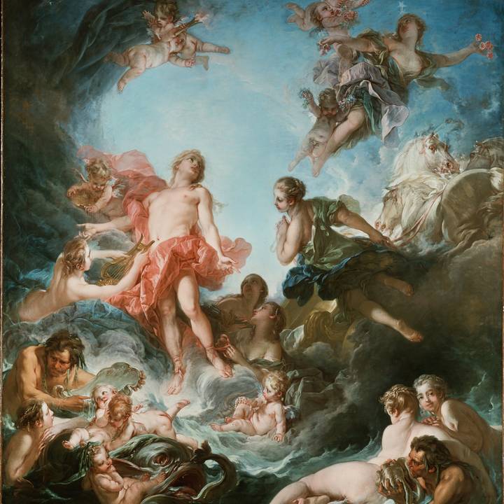
The Rising and the Setting of the Sun were designs for Gobelins Tapestry – surely amongst Pompadour’s most prized pieces of personal propaganda?
Their large scale and complex iconography render them impressive and intriguing today. Louis XV has the youthful athletic body of Apollo, identifiable through his attribute the lyre.
The sea nymph is clearly modelled on Madame de Pompadour who welcomes him back with open arms, as Night draws the veil of dusk.
The message (cloaked in classical garb) is deceptively simple - only the King’s former mistress can offer refuge from his cares at the close of each day.
By the 1780s the Rococo style was deemed excessively feminine due to its curving lines and pastel colours; normative notions of gender roles termed it ‘effeminate’ and ‘emasculating’.
Conventional conduct literature assigned the woman’s place to the home, as model of morality to her family. Madame de Pompadour was judged harshly for exerting undue influence on the King, ‘meddling’ in politics, i.e. overstepping traditional bounds of subservient womanhood.
In 1827 Boucher’s paired paintings changed hands for only 380 francs, but the 4th Marquess paid 20,000 francs in 1855. With considerable disposable wealth, he was aware that he was partly responsible for raising prices.
Displaying works alongside ‘great’ artists like Titian elevated the status of the recently reviled Rococo, and soon its star had risen again. Favourable critics concluded that:
‘…The pretty is the tone of its morals. The pretty is the school of its fashions. The pretty is the spirit of the age – and it is the genius of Boucher’ (1895)
The adjective ‘pretty’ is often seen as feminine, but does it also carry with it a dismissive air? Nowadays we say that ‘there is no accounting for taste’ and that ‘beauty is in the eye of the beholder’.
It was enough for Henri Matisse that ‘great’ art should be decorative and as comfortable as an ‘armchair’, but in the wake of the shock tactics of so much contemporary art is it enough to prettily please the eye, and is it still relevant to speak in gendered terms about colours on canvas?
The contemporary art world has finally acknowledged that a woman’s place is in the gallery. Normative notions of the ‘male gaze’ are under scrutiny, with women more likely viewed as active makers, than passive muses.
Today’s artists and audiences delight in viewing and re-viewing the Old Masters through the lenses of class, gender, ethnicity and sexuality. Queer theory has liberated notions of ‘kitsch’, ‘camp’ and ‘bling’ and turned negative epithets into positives. We are less likely to equate a painterly style or colour palette with moral values or have fixed attitudes to notions of ‘good’ or ‘bad’ taste.
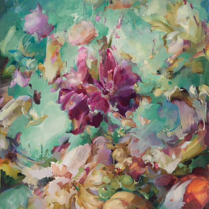
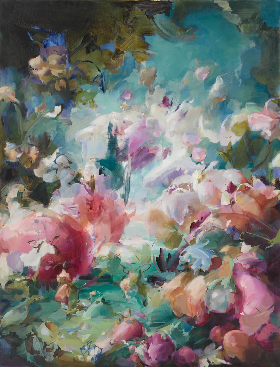
Flora Yukhnovich’s work suggests engagement with all the above ideas and stimulates our thinking. Her largescale canvases and cotton-candy colouring demand our attention, but her bold compositions defy easy explanation.
Explicit subject matter yields to exploration of masses and gesture. Conscious mark-making, layering and erasure of paint layers emphatically recall the artist’s agency, with the sensuality of subject matter giving way to a sensuous property of painterliness.
Would you describe her treatment of tone and colour ‘Rococo’? White cube model, or richly-gilded interiors, how does the display context affect how we read her paintings, and those of her eighteenth-century forefathers? Does contemplation of her work affect how we view, re view, or review Rococo? You decide.
This article was written by Jacqui Ansell, Senior Lecturer at Christie's Education.