On the morning of May 30, 1770, François Boucher died in his apartment in the Palais du Louvre. The most influential painter of his generation, he left behind a brilliant legacy that resonates through French painting — one thinks of Delacroix, Renoir, Matisse — and beyond.
Boucher forged an idiosyncratic path with his colours. His paintings are experimental cocktails of jewelled tones, bold contrasts, and creamy pastels, combined in a way never been seen before.
When he died on that May morning, his prized possessions included a specially ornamented pigment box with eleven drawers and a porphyry stone for grinding colours.
Blue
‘Nature is too green, and badly lit,’ wrote Boucher, and it is undeniable that his world is dominated, not by green, but by a related shade: blue. Boucher’s technique was made possible by the discovery, in 1704, of the pigment known as Prussian blue.
The surprise result of a laboratory experiment gone awry, Prussian blue redefined the art world. It was cheap, easy to use in mixtures, and relatively stable.
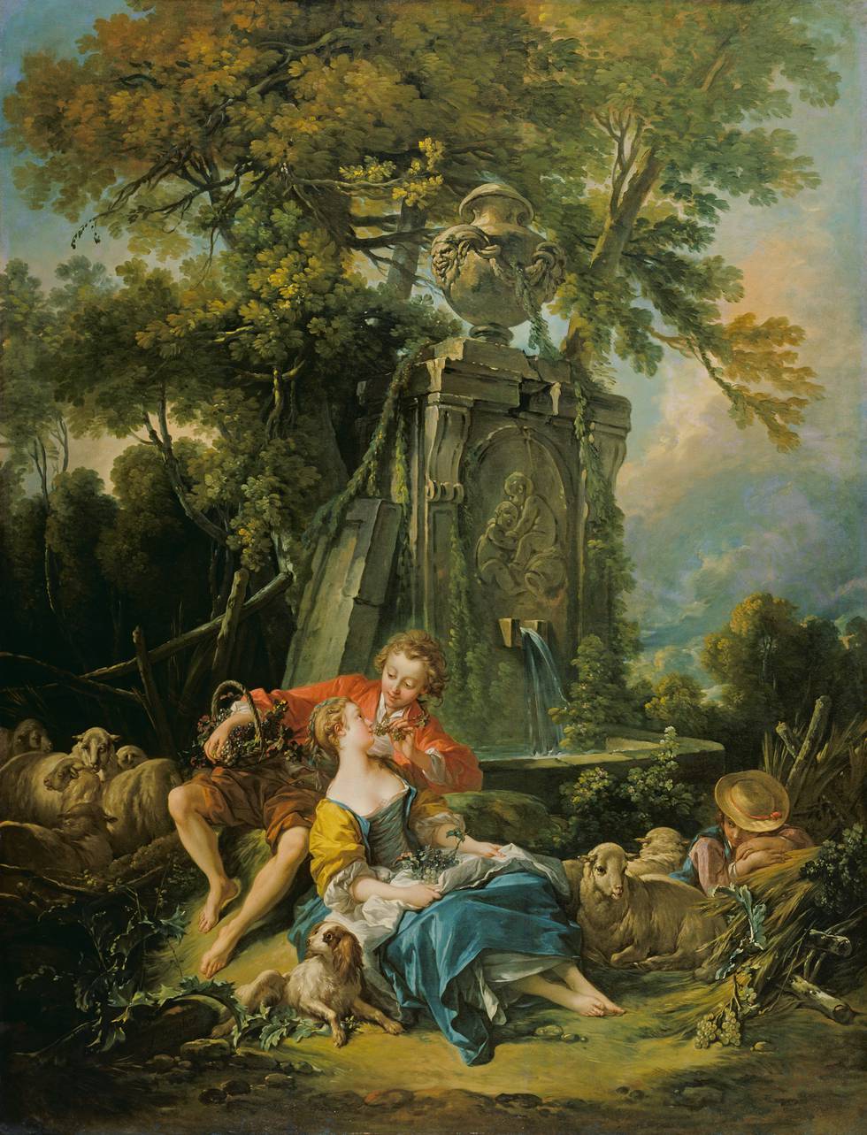
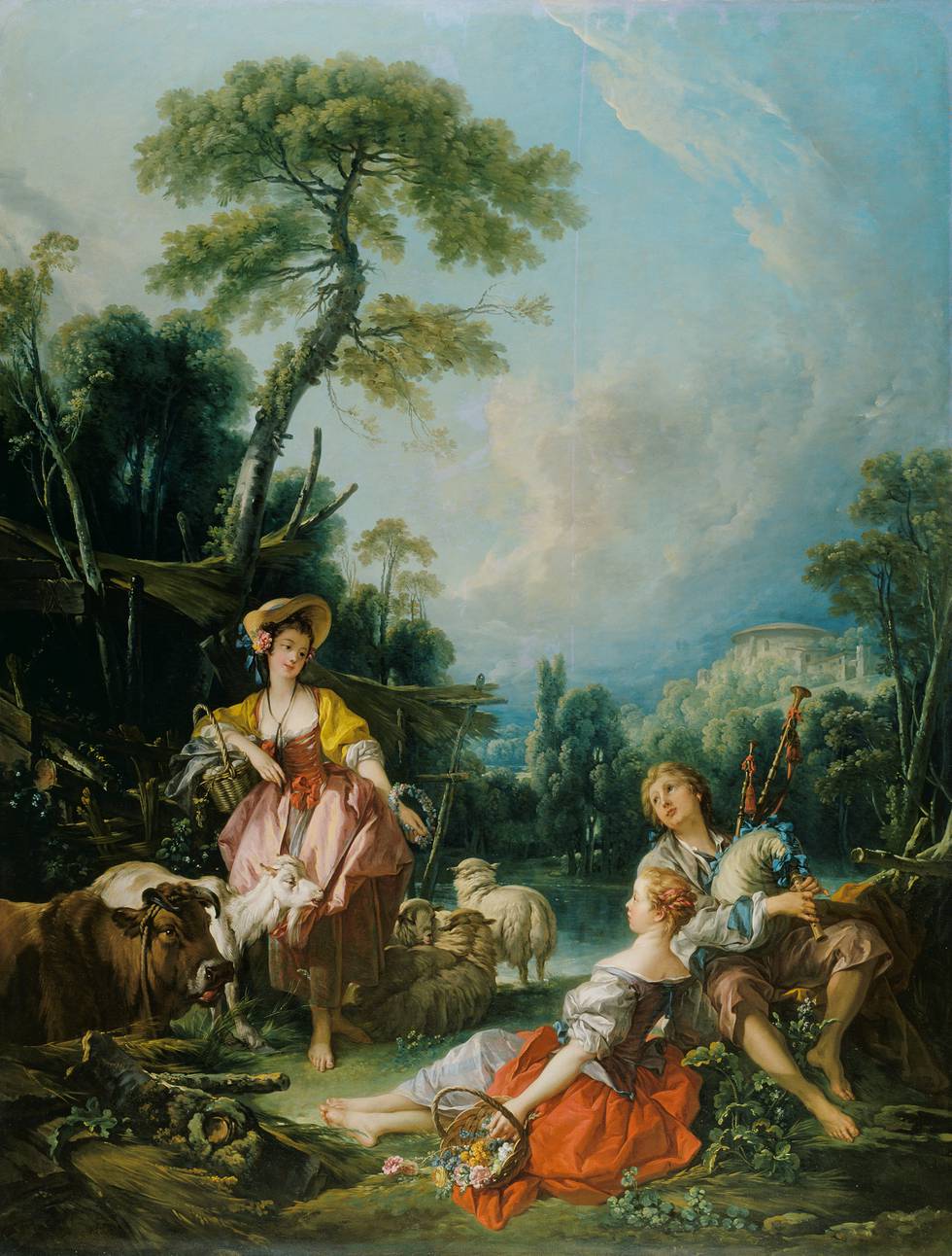
Studies show that this pigment forms the basis for Boucher’s foliage. It colours his never-ending skies. Without Prussian blue, large-scale canvases such as Pastoral with a Bagpipe Player or Pastoral with a Couple Near a Fountain would have been prohibitively expensive.
Prussian blue sparked a revolution in painting on the level of the discovery of photography — and Boucher ran with it, tinting everything blue in the process.
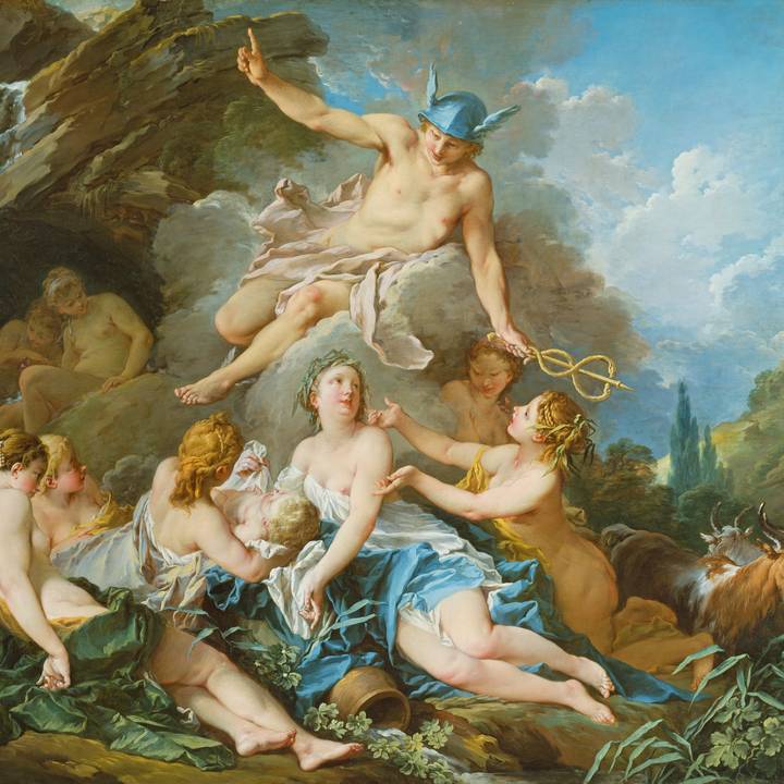
Orange
The vibrant hue of the fruit that gives orange its name is rare in Boucher’s palette. It punctuates some early works, such as the shepherd’s tangerine jacket in Imaginary Landscape (1734), but subsequently it is generally absent — somewhat surprisingly given Boucher’s interest in rich, blue skies and oceans.
As Van Gogh advised of these complementary colours, ‘if you do blue, then do orange and yellow as well, surely!’
In Boucher’s day, however, this colour usually relied on realgar (arsenic sulphide), a toxic mineral that often faded towards yellow over time. Its ill-fit with the rosy female flesh in Boucher’s mythologies might have also given pause.
Rather, Boucher ingeniously included orange in his palette as a recipe awaiting mixture in the viewer’s mind: he repeatedly presented in close juxtaposition red and yellow, the primary colours that compose orange.
More unusually, he revealed this game by including near his reds and yellows a subdued, burnt orange on male figures (an easier fit with their tawnier complexions).
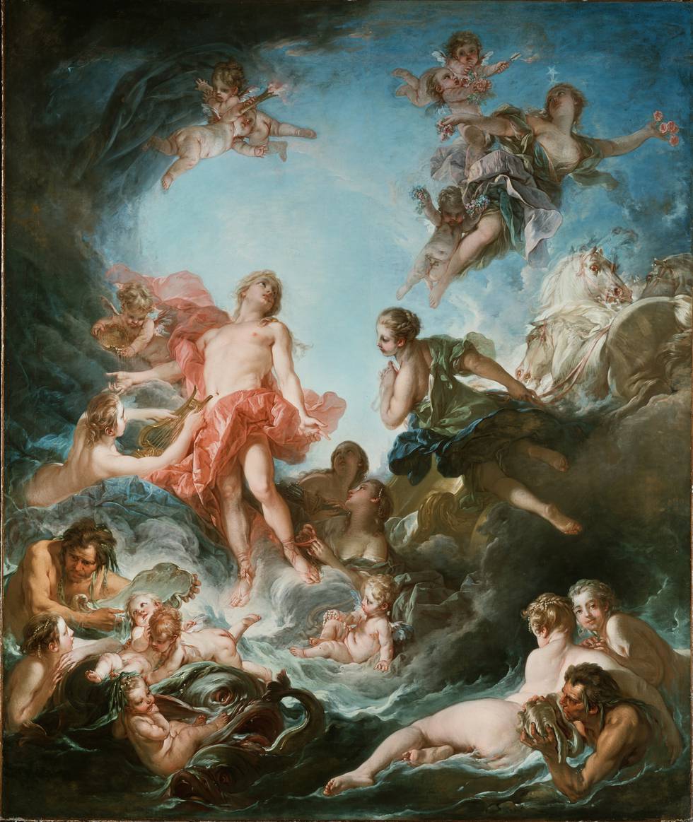
In Mars and Venus Surprised by Vulcan, Boucher again asks his viewer to combine hues themselves, but slightly shifts the colour wheel from red and yellow to pink and yellow.
The magnificent arch of shot silk composed of pink and yellow paint veers towards orange, but never really lands there, resulting in an intense, flickering coral that is one of the artist’s greatest tours-de-force.
It also unveils the recipe with which Boucher ignites the fiery tip of the torches borne by putti throughout his œuvre, in which a more obvious use of a purer orange would have disrupted his harmonious palette.
By David Pullins, Associate Curator, The Metropolitan Museum of Art
White
Fundamental to the eighteenth-century palette was lead white. Combined with oil, lead white produced one of the most pleasurable paints to work with. Mixed with oil paint made from other pigments, it improved handling and accelerated drying times.
In order for Boucher to produce his pastels— canary yellow, pale pink, minty green, baby blue — he used lead white more than most, and he clearly revelled in it. Its luscious texture lent itself perfectly to his muscular, gestural brushwork.
But Boucher’s affection for it came with a price. The toxic substance can cause to lead poisoning. It may have been responsible for his reduced ability to see colour late in life — when he complained to a fellow artist that ‘he saw only earth colours where others saw vermilion [bright red]’.
Perhaps for this reason, a magnifying glass and eyeglasses were found alongside his pigment box and grinding stone after his death.
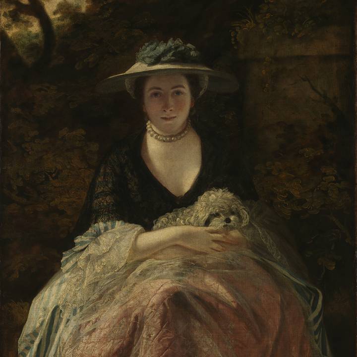
Pink
Boucher did not invent pink, but he is perhaps the artist most associated with this colour. In the nineteenth century, the Goncourt brothers — French authors and aesthetes — enthused about his ‘pink tender and pale like a rain-soaked rose (rose noyée).’ More recently, he has been criticised for an overuse of this ‘feminine’ colour.
Pink appeared in paintings before Boucher’s time often in the Virgin’s costume as she held the baby Jesus. (A lovely example by the Spanish artist Murillo can be found in the Wallace Collection’s Great Gallery).
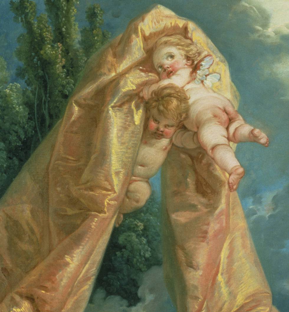
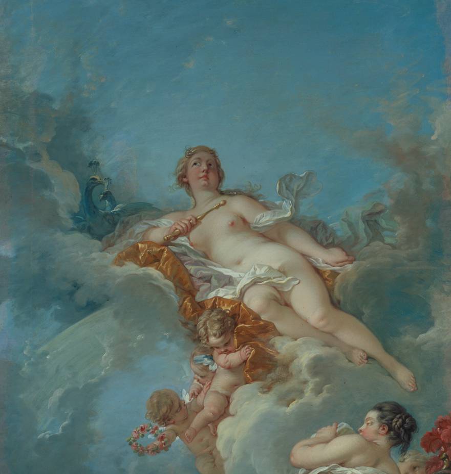
These works suggest that pink was associated with maternal devotion. In Boucher’s output, the powerful Venus, goddess of love, lies beneath yards of coral pink silk, held aloft by two dimpled putti.
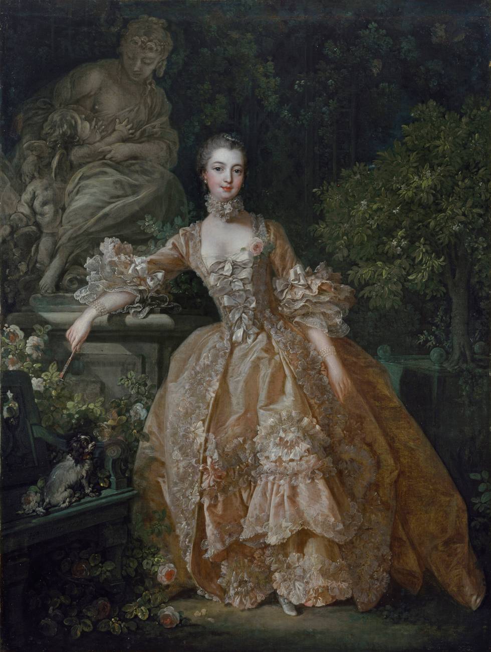
These dual associations (maternal succour and carnal love) are evident in Boucher’s Portrait of Madame de Pompadour. The inclusion of Pigalle’s Love Embracing Friendship suggests Pompadour’s own hope for fecundity in her relationship, as titular mistress to Louis XV. By 1759, the year that Boucher painted Pompadour in a shell-pink dress in a garden, she had already commissioned two images that utilised pink as the central colour.
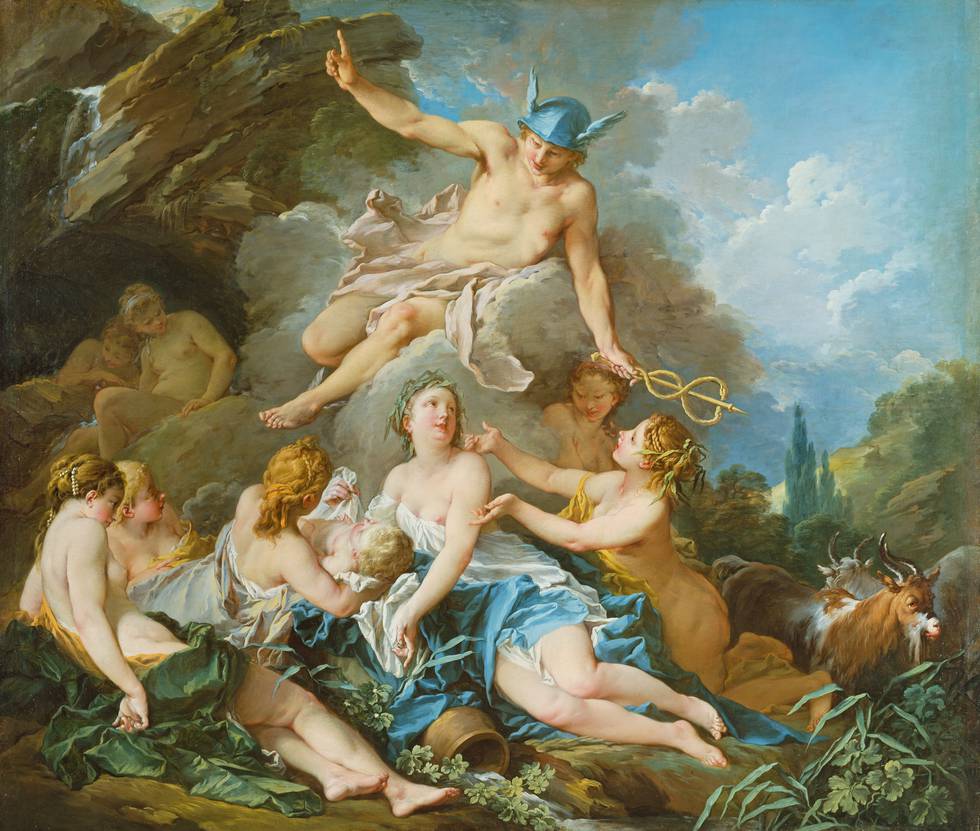
In the Rising and Setting of the Sun, the figure of Apollo (the symbol of the French kings) is swathed in pink fabric. Here, pink is not gendered female, but instead associated with power. Similarly in Mercury confiding the Infant Bacchus to the Nymphs and Jupiter and Callisto, the male gods appear in pink. Pink is thereby transferred from more traditional allegorical realms to add symbolic weight to the representation of Pompadour.
It not only shows a beautiful woman in a garden setting but marks out Pompadour as both powerful woman at court and singular patron of Boucher.
By A. Cassandra Albinson, Margaret S. Winthrop Curator of European Art & Interim Head, Division of European and American Art, Harvard Art Museums
Boucher claimed to have completed 1,000 paintings and 10,000 drawings in his lifetime. These numbers speak to his process as well as his productivity. He carefully built up to large compositions: initial drawings for individual figures were followed by compositional studies and lively oil sketches laying out entire scenes.
Close looking at his finished paintings reveals traces of his creative hand. Soft brown outlines discreetly trace the contours of bodies — the turn of a leg muscle, the edge of a shoulder. Likely made in an earth pigment, these discreet markers glimmer through brighter paints. They provide glimpses into the artist’s mind, as if he was still here, thinking his way through the paint.